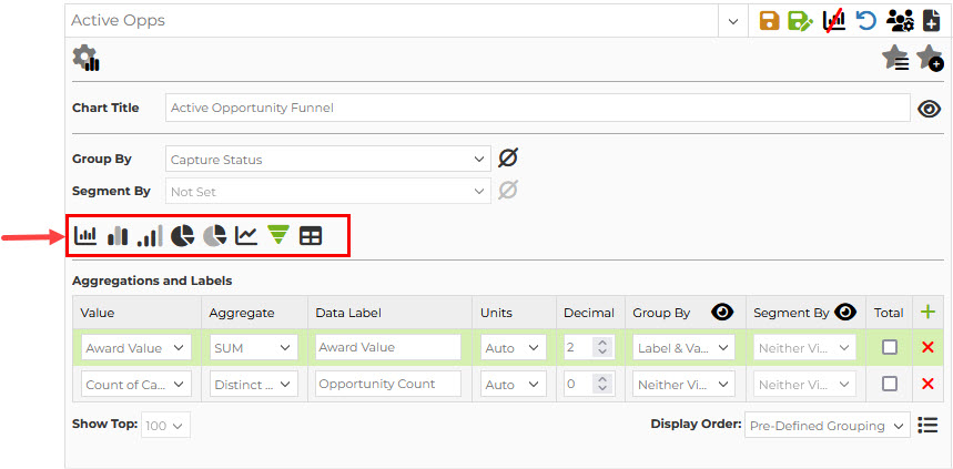
Chart Types
Capture2Proposal has eight chart and graph types available for use. They are represented by the icons in the chart settings area.
![]() Bar Graph and Stacked Bar Graph
Bar Graph and Stacked Bar Graph
This chart type is the most commonly used, and works with both group by (x-axis) and segment by (stacked values) options. C2P bar graphs have vertical bars, and are limited to 100 bars or fewer per graph.
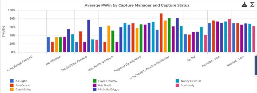
![]() Clustered Bar Chart - Standard
Clustered Bar Chart - Standard
![]() Clustered Bar Chart - Continuous
Clustered Bar Chart - Continuous
Clustered bar charts are useful for showing the level of effort for each individual segment grouped together on the x-axis for a side-to-side comparison of the data.
A standard clustered bar chart shows blank spaces where there is no data for a specific segment within that x-axis grouping. It gives a quick visual presentation of where data is null or missing.
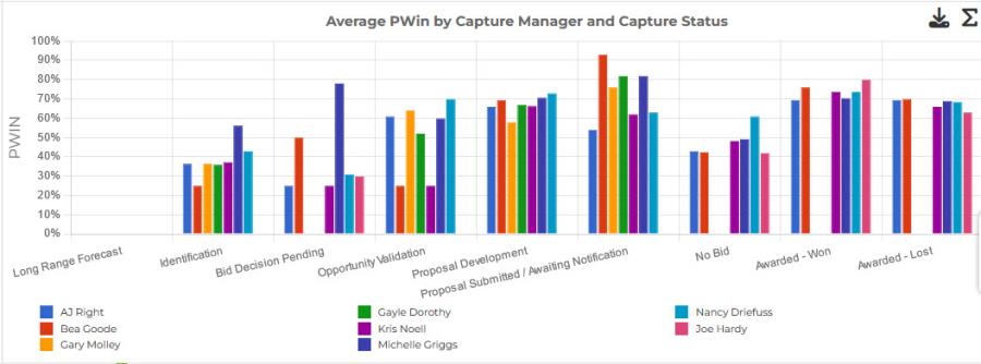
A continuous clustered bar chart removes the empty spaces for null columns. The view is smoother, and often used when a clustered bar chart is selected with a date-based x-axis. However, it is more difficult to identify null data without carefully tracking the legend and bar colors in the chart. It will not hide an x-axis value for which there is no data for any of the segments, as seen below.
![]() Pie Chart - Limited to Top x Values
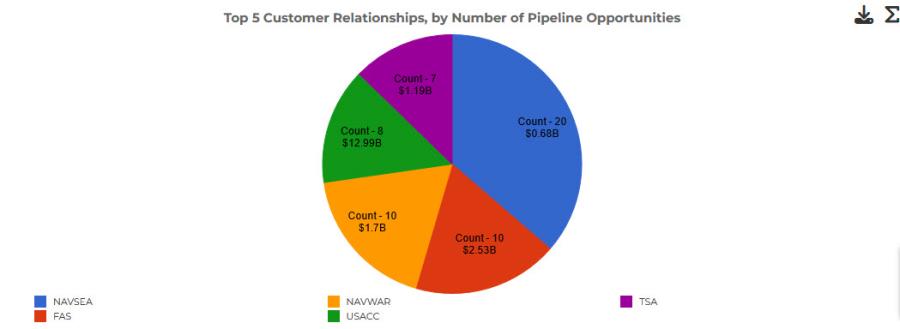
Pie Chart - Limited to Top x Values
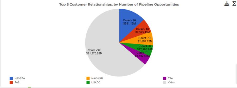
![]() Pie Chart
Pie Chart
Pie charts are great for quickly gauging what portion of a total is comprised of its pieces. Capture2Proposal's pie charts are built using a single grouping to determine the pie segments; these segments cannot be further subdivided into additional groupings. If you switch a graph setting from a type that uses two groups, such as a clustered bar chart, the setting for the segments in that chart will not be applied in the pie chart, but you value that had been used for the segmenting will be maintained, so don't worry abut trying different chart types out and losing information.
A pie chart limited to the top x values will only show those segments, so if x = 5, then the whole pie will be the combined value of the top five elements in the data set. The data set shown on the page will still include all of the elements; it will not be filtered to include only the top x values.
A standard pie chart will not be limited to the top x values, however, it will show "other" for the remaining values after the top x. This allows you to clearly see how large a portion of the total the top x represents.
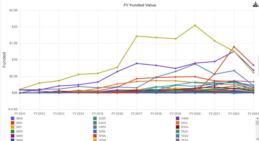
![]() Line Graph
Line Graph
Line graphs are another great way to represent changes over time. They also are great for seeing the relative values of various segments of the data, similar to a cluster bar chart view. These graphs often require a clean set of data, but can be used to great effect for analyzing trends.
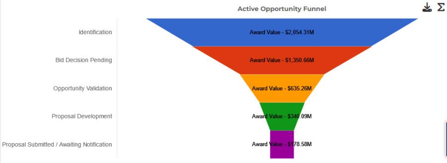
![]() Funnel Chart
Funnel Chart
Funnel charts are best used for processes. This is the default chart setting for charts built with Capture Status as the grouping mechanism, although the chart type can be changed. The shape of the funnel lets you know the health of the process; is it truly funnel shaped as you move through the steps of the process?
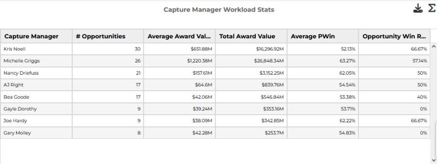
![]() Table
Table
While our full data set is a table already, using a table in the charts is a great way to pull together different aggregates. Like with Pie Charts, Capture2Proposal's tables are built using a single grouping to determine the pie segments; these segments cannot be further subdivided into additional groupings. However, the use of chart aggregations and the easily visible data for all of the column values in tables makes the table a very powerful tool.